Like everything else there is a proper way to decorate the church altars.
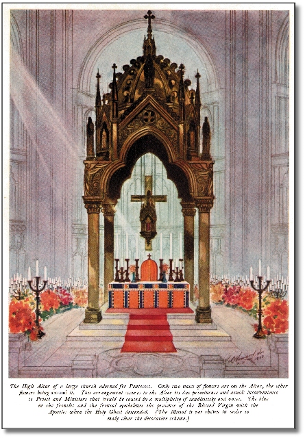
![GorgFeast-Church_MainAltar[1]](http://www.magnificatmedia.com/wp-content/uploads/2016/01/GorgFeast-Church_MainAltar1.jpg) As a general rule, decorating the altar and the sanctuary should be done in moderation according to the size of the church. When it comes to flowers in particular, they should always be done with moderation and placed preferably around the altar instead of on its mensa. The rules regarding altar flowers from The Caeremoniale Episcoporum (I, xii, n. 12) states “that between the candlesticks on the altar may be placed natural or artificial flowers, which are certainly appropriate ornaments of the altar. The flowers referred to are cut flowers, leaves, and ferns, rather than plants imbedded in soil in large flowerpots, although the latter may fitly be used for the decoration of the sanctuary around the altar. If artificial flowers are used they ought to be made of superior material, as the word serico (ibid.) evidently implies, and represent with some accuracy the natural variations. Flowers of paper, cheap muslin, or calico, and other inferior materials, and such as are old and soiled, should never be allowed on the altar.” Here again the simplest arrangements are most suitable. Our attention should be on the actions of Holy Sacrifice and the altar and not have our senses be overwhelmed by the size and color of the arrangements. Such a thing detracts us from our purpose, to give all honor and glory to Our Lord.
As a general rule, decorating the altar and the sanctuary should be done in moderation according to the size of the church. When it comes to flowers in particular, they should always be done with moderation and placed preferably around the altar instead of on its mensa. The rules regarding altar flowers from The Caeremoniale Episcoporum (I, xii, n. 12) states “that between the candlesticks on the altar may be placed natural or artificial flowers, which are certainly appropriate ornaments of the altar. The flowers referred to are cut flowers, leaves, and ferns, rather than plants imbedded in soil in large flowerpots, although the latter may fitly be used for the decoration of the sanctuary around the altar. If artificial flowers are used they ought to be made of superior material, as the word serico (ibid.) evidently implies, and represent with some accuracy the natural variations. Flowers of paper, cheap muslin, or calico, and other inferior materials, and such as are old and soiled, should never be allowed on the altar.” Here again the simplest arrangements are most suitable. Our attention should be on the actions of Holy Sacrifice and the altar and not have our senses be overwhelmed by the size and color of the arrangements. Such a thing detracts us from our purpose, to give all honor and glory to Our Lord.
To show the Church’s mindset of the importance of feast days and a general attitude, there are degrees of liturgical decoration. For instance, Christmastide is a joyful liturgical 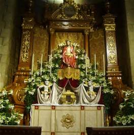 season and our altar and sanctuary should reflex as such. Lent and Advent are penitential seasons and in a funeral liturgy it also reflex a somber mourning.
Colors and combining colors also has rules. Factors determining the color to be used are the architectural decorations of the church and the color of the vestments or frontal of the day. There are three types of color combinations most suitable for church arrangements: the monochromatic or one-color scheme, the analogous or related scheme, and the complementary or contrasting color scheme. Perhaps the monochromatic is the most effective, being the simplest and easiest to make successfully. To make a monochromatic flower arrangement use flowers of different values or tones of one hue. A monochromatic scheme in red carnations, for instance, is the easiest because they are available in many tones from dark to light, will make an effective monochromatic bouquet. The red can range from deep red to a pink, almost white tone. The analogous color scheme is made by using flowers of different colors in sequence as they appear on a color wheel, such as; red, red-orange, orange, orange-yellow, yellow. Such a combination of warm colors may be made of chrysanthemums in an autumn arrangement. However, it is important to remember to group the different colors together, for, if they are scattered and mixed together in the vase, the effect will not be the same. Analogous color schemes may be warm or cold, depending on which side of the color  wheel you use. The warm colors are red and orange and their intermediates, while the cold colors are blue and green and any colors that contain any blue or green. A complementary or contrasting color scheme uses colors from opposite sides of the color wheel; that is, two hues which complement each other. Simple complementaries are blue and orange, red and green, violet and yellow. To be successful, the two colors should be of equal intensity but of varying amounts. Cool and warm colors can be combined. It is necessary, also, to consider the lightness and darkness of the flowers used and, if a strong and brilliant arrangement is desired, use flowers of the same values, except perhaps at the center of interest where a stronger or deeper value may be effectively used. If soft effects are desired various shades of pink, blue, and lavender may be combined or ‘interlaced’ so that from a distance they seem united in one delicate blend of color. However a triad color scheme, that is, one based on three primary colors, red, blue and yellow, which usually results in what is called a mixed bouquet, is not so satisfactory for the church. The triad color scheme, being more complex, does not have the directness and simplicity of the other types of color scheme. Floral arrangements and colors should be especially moderate during Advent and which are forbidden during Lent except for the Laetare Sunday (Fourth Sunday of Lent), as well as solemnities and feasts.
While the decoration of the sanctuary should remain secure, there should be plenty of space for traditional elements that reflect the liturgical season. For instance, Advent wreath and room for poinsettias at Christmastide, etc. Decorations and colors in Advent shouldn’t overshadow the joy of Christmas and during Lent there is no flowers but with some exceptions.
No matter what liturgical season we’re in, the Church provides us with the classification of Sundays, Feast Days, octaves, vigils and ferial days by class. She gives us direction on the color of the vestments and proper color scheme of the altar and sanctuary to set our mood or approach towards each liturgical season and more specifically each day to bring us closer to the One who sacrificed the most, Our Lord Jesus Christ, Who ultimately brings us closer to God.